

Thêm hiệu ứng hover cho button cực đẹp với CSS3
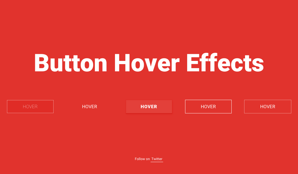
Trong quá trình thiết kế web, chắc hẳn là các bạn sẽ dùng tới button rất nhiều vào trong trang web hay blog của mình. Hôm nay, mình xin chia sẻ cho các bạn thêm một vài button với hiệu ứng hover cực đẹp, các bạn có thể ứng dụng vào trong các dự án của mình. Cùng tìm hiểu chi tiết về cách thêm hiệu ứng hover cho button cực đẹp với CSS3 qua nội dung sau nhé.
HTML
Đầu tiên, chúng ta cần có khung chuẩn html như sau :
01 02 03 04 05 06 07 08 09 10 11 12 13 14 15 16 17 18 19 20 21 22 23 24 25 26 27 | <section class="buttons"> <div class="container"> <h1>Button Hover Effects</h1> <svg> <rect x="0" y="0" fill="none" width="100%" height="100%"/> </svg> Hover </a> <!--End of Button 1 --> <!--End of Button 2 --> <!--End of Button 3 --> <!--End of Button 4 --> <!--End of Button 5 --> </div></section> |
CSS
Và sau đây là toàn bộ đoạn css giúp các bạn tạo được hiệu ứng button :
001 002 003 004 005 006 007 008 009 010 011 012 013 014 015 016 017 018 019 020 021 022 023 024 025 026 027 028 029 030 031 032 033 034 035 036 037 038 039 040 041 042 043 044 045 046 047 048 049 050 051 052 053 054 055 056 057 058 059 060 061 062 063 064 065 066 067 068 069 070 071 072 073 074 075 076 077 078 079 080 081 082 083 084 085 086 087 088 089 090 091 092 093 094 095 096 097 098 099 100 101 102 103 104 105 106 107 108 109 110 111 112 113 114 115 116 117 118 119 120 121 122 123 124 125 126 127 128 129 130 131 132 133 134 135 136 137 138 139 140 141 142 143 144 145 146 147 148 149 150 151 152 153 154 155 156 157 158 159 160 161 162 163 164 165 166 167 168 169 170 171 172 173 174 175 176 177 178 179 180 181 182 183 184 185 186 187 188 189 190 191 192 193 194 195 196 197 198 199 200 201 202 203 204 205 206 207 208 209 210 211 212 213 214 215 216 217 218 219 220 221 222 223 224 225 226 227 228 229 230 231 232 233 234 235 236 237 238 239 240 241 242 243 244 245 246 247 248 249 250 251 252 253 254 255 | * { box-sizing: inherit; transition-property: all; transition-duration: .6s; transition-timing-function: ease;}html,body { box-sizing: border-box; height: 100%; width: 100%;}body { background: #E1332D; font-family: 'Roboto', sans-serif; font-weight: 400;}.buttons { display: table; height: 100%; width: 100%;}.container { display: table-cell; padding: 1em; text-align: center; vertical-align: middle;}h1 { color: #fff; font-size: 1.25em; font-weight: 900; margin: 0 0 2em;}@media (min-width: 450px) { h1 { font-size: 1.75em; }}@media (min-width: 760px) { h1 { font-size: 3.25em; }}@media (min-width: 900px) { h1 { font-size: 5.25em; margin: 0 0 1em; }}p { color: #fff; font-size: 12px;}@media (min-width: 600px) { p { left: 50%; position: absolute; transform: translate(-50%, 0); top: 90%; }}@media (max-height: 500px) { p { left: 0; position: relative; top: 0; transform: translate(0, 0); }}p a { background: rgba(255, 255, 255, 0); border-bottom: 1px solid; color: #fff; line-height: 1.4; padding: .25em; text-decoration: none;}p a:hover { background: white; color: #E1332D;}.btn { color: #fff; cursor: pointer; display: block; font-size: 16px; font-weight: 400; line-height: 45px; margin: 0 auto 2em; max-width: 160px; position: relative; text-decoration: none; text-transform: uppercase; vertical-align: middle; width: 100%;}@media (min-width: 400px) { .btn { display: inline-block; margin-right: 2.5em; } .btn:nth-of-type(even) { margin-right: 0; }}@media (min-width: 600px) { .btn:nth-of-type(even) { margin-right: 2.5em; } .btn:nth-of-type(5) { margin-right: 0; }}.btn:hover { text-decoration: none;}.btn-1 { background: #e02c26; font-weight: 100;}.btn-1 svg { height: 45px; left: 0; position: absolute; top: 0; width: 100%;}.btn-1 rect { fill: none; stroke: #fff; stroke-width: 1; stroke-dasharray: 422, 0;}.btn-1:hover { background: rgba(225, 51, 45, 0); font-weight: 900; letter-spacing: 1px;}.btn-1:hover rect { stroke-width: 5; stroke-dasharray: 15, 310; stroke-dashoffset: 48; transition: all 1.35s cubic-bezier(0.19, 1, 0.22, 1);}.btn-2 { letter-spacing: 0;}.btn-2:hover,.btn-2:active { letter-spacing: 5px;}.btn-2:after,.btn-2:before { backface-visibility: hidden; border: 1px solid rgba(255, 255, 255, 0); bottom: 0px; content: " "; display: block; margin: 0 auto; position: relative; transition: all 280ms ease-in-out; width: 0;}.btn-2:hover:after,.btn-2:hover:before { backface-visibility: hidden; border-color: #fff; transition: width 350ms ease-in-out; width: 70%;}.btn-2:hover:before { bottom: auto; top: 0; width: 70%;}.btn-3 { background: #e3403a; border: 1px solid #da251f; box-shadow: 0px 2px 0 #d6251f, 2px 4px 6px #e02a24; font-weight: 900; letter-spacing: 1px; transition: all 150ms linear;}.btn-3:hover { background: #e02c26; border: 1px solid rgba(0, 0, 0, 0.05); box-shadow: 1px 1px 2px rgba(255, 255, 255, 0.2); color: #ec817d; text-decoration: none; text-shadow: -1px -1px 0 #c2211c; transition: all 250ms linear;}.btn-4 { border: 1px solid; overflow: hidden; position: relative;}.btn-4 span { z-index: 20;}.btn-4:after { background: #fff; content: ""; height: 155px; left: -75px; opacity: .2; position: absolute; top: -50px; transform: rotate(35deg); transition: all 550ms cubic-bezier(0.19, 1, 0.22, 1); width: 50px; z-index: -10;}.btn-4:hover:after { left: 120%; transition: all 550ms cubic-bezier(0.19, 1, 0.22, 1);}.btn-5 { border: 0 solid; box-shadow: inset 0 0 20px rgba(255, 255, 255, 0); outline: 1px solid; outline-color: rgba(255, 255, 255, 0.5); outline-offset: 0px; text-shadow: none; transition: all 1250ms cubic-bezier(0.19, 1, 0.22, 1);}.btn-5:hover { border: 1px solid; box-shadow: inset 0 0 20px rgba(255, 255, 255, 0.5), 0 0 20px rgba(255, 255, 255, 0.2); outline-color: rgba(255, 255, 255, 0); outline-offset: 15px; text-shadow: 1px 1px 2px #427388;} |
Các bạn thấy sao ? Rất đẹp đúng không nào, button mà mình giới thiệu cho các bạn trong bài viết này chỉ là phụ, mục đích chính là muốn các bạn hiểu và sử dụng rõ CSS3 cho các dự án thiết kế web của các bạn sau này.
Chúc các bạn thành công !
*** Một số chủ đề đáng chú ý: